PNG vs JPG vs WebP — Which Image Format Should You Use on Your Website?
Images account for over 50% of average page weight, making format selection critical for performance, user experience, and search ranking. Choosing the wrong format wastes bandwidth, slows mobile delivery, and can reduce conversions. This guide explains the strengths and trade-offs of PNG, JPG, and WebP, shows when to use each, and provides actionable compression techniques to help your pages load faster while maintaining visual quality.
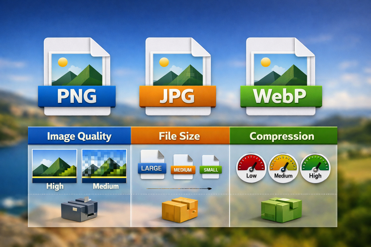
Hero visual comparing PNG, JPG, and WebP formats for web performance and image quality.
📑 Table of Contents
⚡ TL;DR (Quick Answer)
- WebP usually delivers the best balance of quality and file size where browser support permits. Always provide JPEG or PNG fallbacks.
- JPEG is the universal standard for photographs when maximum compatibility or post-publication editing is needed.
- PNG is essential for graphics with transparency, sharp UI elements, logos, and screenshots.
- Always serve responsive images using srcset and sizes attributes; compress aggressively before upload.
- Lazy load below-the-fold images and reserve space with width/height attributes to prevent cumulative layout shift (CLS).
Quick Format Overview
Each format excels at different tasks. Understanding these strengths helps you make the right choice for each image:
Type: Lossless
Use for: Logos, icons, screenshots, graphics with transparency
File size: Larger than JPG/WebP
Key strength: Perfect clarity, supports transparency and sharp edges
Type: Lossy
Use for: Photographs, images with smooth color gradients
File size: Compact, widely supported
Key strength: Excellent compatibility and small file sizes for photographs
Type: Both lossy and lossless modes
Use for: Modern web delivery, performance-critical sites
File size: 25–35% smaller than JPG/PNG
Key strength: Superior compression; requires fallbacks for older browsers
Quality vs File Size — Practical Comparison
The best format depends on your content type and acceptable file size. Here's practical guidance:
Photographs and Real-World Content
For photos with smooth gradients and natural lighting, lossy compression is ideal. JPEG at quality 75–85 or WebP at quality 70–80 delivers excellent visual quality while keeping file sizes manageable.
| Content Type | Recommended Format | Quality Setting | Typical Size (1600px width) |
|---|---|---|---|
| Hero photo / banner | WebP with JPEG fallback | 75–80 | WebP: 120–180 KB JPEG: 200–300 KB |
| Product photo | JPEG or WebP | 80–85 | WebP: 80–120 KB JPEG: 150–200 KB |
| Thumbnail image | WebP or JPEG | 60–75 | WebP: 15–25 KB JPEG: 30–50 KB |
| Logo / icon (no transparency) | Optimized PNG or WebP | N/A (lossless) | PNG: 5–15 KB (optimized) |
| Screenshot or diagram | PNG or lossless WebP | N/A (lossless) | PNG: 50–200 KB |
Graphics and Illustrations
Images with sharp lines, solid colors, or transparency require lossless quality. PNG is the universal fallback. Lossless WebP cuts file size by 25–35% compared to PNG while maintaining exact quality.
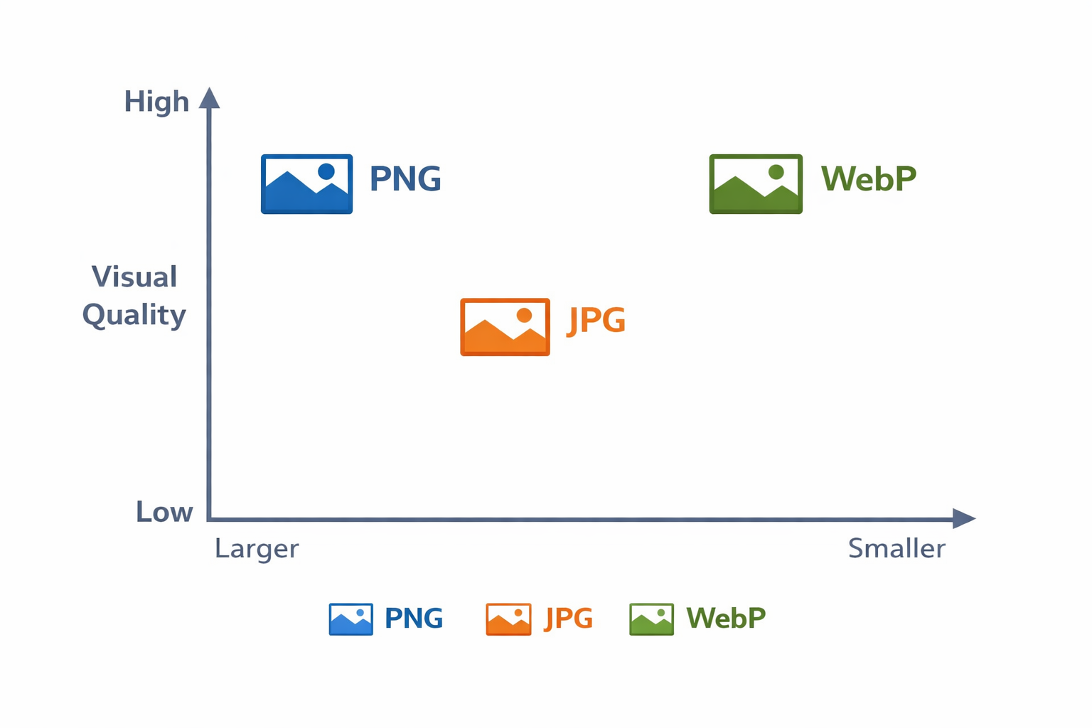
Visual comparison showing relative file sizes and quality across PNG, JPG, and WebP formats at equivalent visual quality levels.
Browser Support and Fallback Strategies
WebP is now supported by all modern browsers (Chrome, Firefox, Edge, Safari 16+). However, older browsers (Safari <16, older Internet Explorer) do not support WebP. Solution: always provide fallbacks.
WebP Browser Support Status (2026)
- Chrome: Full support since 2010
- Firefox: Full support since 2018
- Edge: Full support since 2020
- Safari: Full support since iOS 16 and macOS Ventura (2022)
- IE 11: No support (requires fallback)
How to Serve WebP with Fallbacks — Using the <picture> Element
The HTML5 <picture> element lets the browser choose the best format automatically:
How it works: Modern browsers load the WebP image. Older browsers skip the WebP source and use the JPEG fallback. The <img> tag is always required as the final fallback.
Responsive Images — Best Practices
Responsive images let browsers download only the size they need, reducing bandwidth waste on mobile devices and improving perceived performance.
Using srcset and sizes for Responsive Delivery
Why This Matters
- srcset: Lists multiple image widths (400w, 800w, 1200w). The browser picks the best match for the user's device.
- sizes: Tells the browser how much space the image will occupy at different breakpoints. This helps the browser calculate which srcset file to use.
- width/height: Reserve layout space to prevent cumulative layout shift (CLS), which impacts Core Web Vitals and SEO.
Lazy Loading for Performance
Load below-the-fold images only when the user scrolls near them:
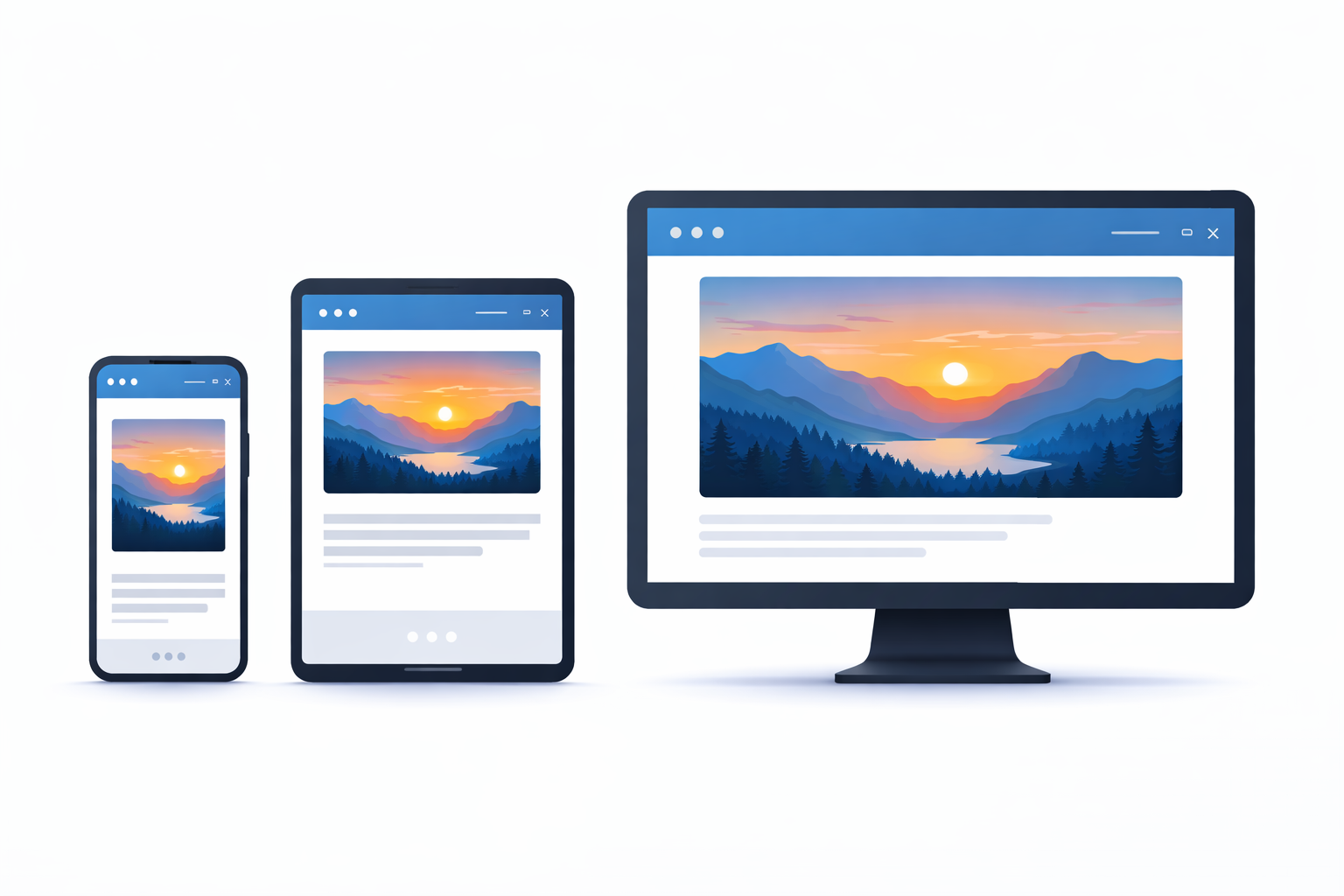
Responsive images automatically scale and load appropriately for each device, improving mobile performance and user experience.
Compression Tools and Techniques
Aggressive compression before upload maximizes the performance gains of choosing a better format.
Popular Online Tools
- Image Compressor (OnlineConvert) — Browser-based, no upload limits, supports PNG, JPG, WebP
- Squoosh — Google's web-based compressor; great for A/B testing formats
- TinyPNG / TinyJPG — Excellent PNG/JPG compression; free tier up to 20 images/month
Compression Best Practices
- For JPEG: Use progressive JPEG encoding and quality 70–85 for photos.
- For PNG: Use PNG8 or PNG quantization where possible; consider converting to WebP for additional savings.
- For WebP: Use lossy mode for photos (quality 70–85) and lossless mode for graphics.
- Always start with high quality, then compress. Never compress, then decompress.
SEO and Accessibility Considerations
Image format affects SEO indirectly through performance and directly through image metadata and alt text.
Alt Text (Critical for SEO and Accessibility)
Always include descriptive alt text. This helps:
- Search engines understand image content and context
- Users with screen readers know what the image shows
- Users see fallback text if the image fails to load
Good alt text example: "A product photo showing a wireless keyboard with a mechanical switch close-up"
Image Filenames and Metadata
- Use descriptive filenames:
product-keyboard-black.jpginstead ofIMG_0042.jpg - Include relevant keywords naturally in filenames and alt text
- When safe, preserve EXIF date and copyright metadata on product photos
Performance Impact on SEO
Faster image delivery improves:
- Page speed — affects ranking and click-through rate
- Core Web Vitals — Largest Contentful Paint (LCP), Cumulative Layout Shift (CLS)
- Mobile experience — critical for SEO in 2026
Recommended Settings by Content Type
| Content Type | Primary Format | Fallback | Quality / Compression | Width (Max) |
|---|---|---|---|---|
| Hero banner | WebP (lossy) | JPEG | Quality 75–80 | 1920px |
| Product photo | JPEG or WebP | JPEG | Quality 80–85 | 1200px |
| Blog post image | WebP (lossy) | JPEG | Quality 75–80 | 1200px |
| Thumbnail | WebP or JPEG | JPEG | Quality 60–70 | 400px |
| Logo / icon | PNG (optimized) | PNG | Lossless, optimized | 256px |
| Screenshot / diagram | PNG (optimized) | PNG | Lossless | 1200px |
Implementation Examples
Example 1: Hero Image with Picture Element
Example 2: Responsive Product Image with Lazy Loading
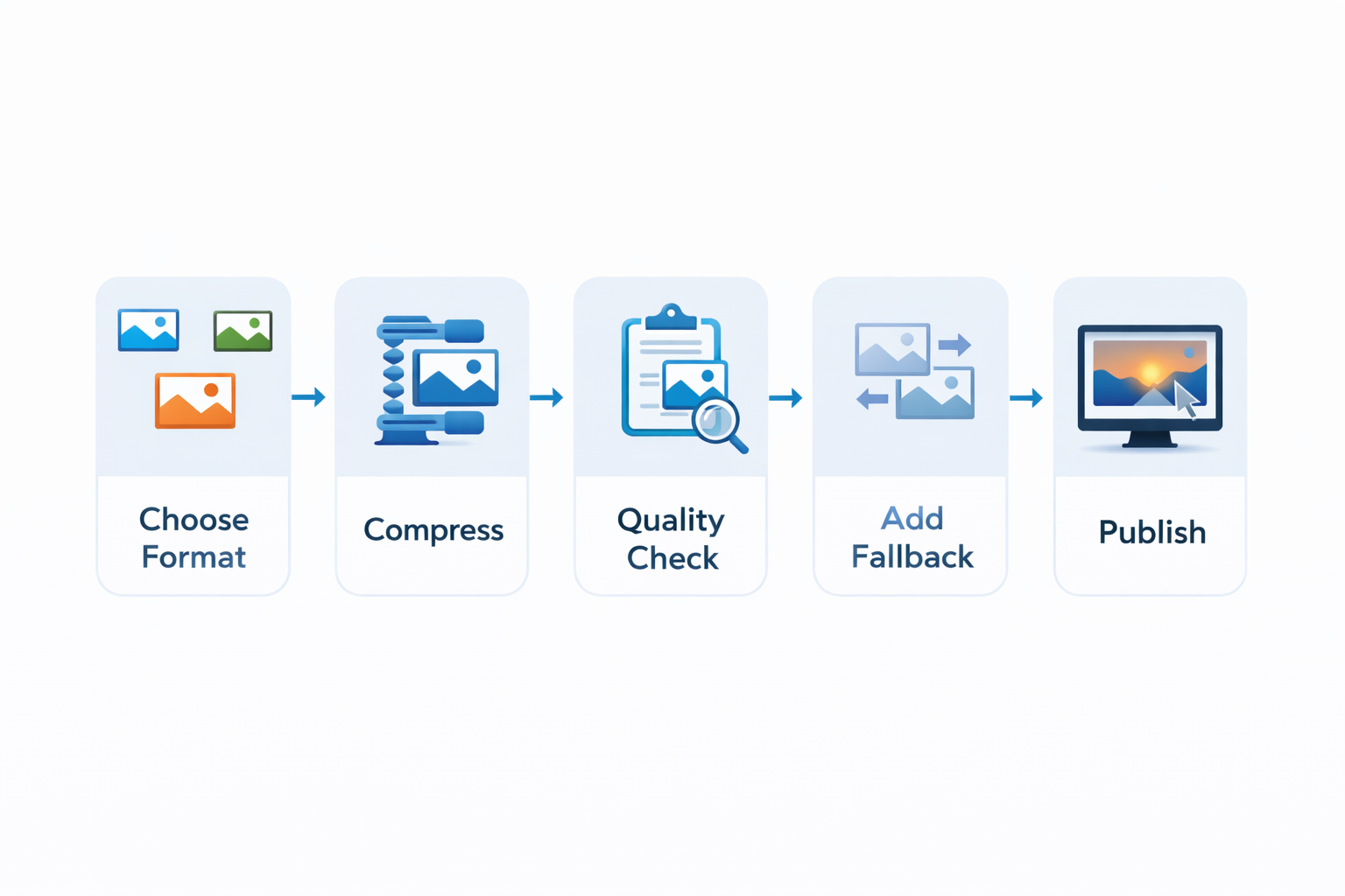
A recommended image optimization workflow: select the right format, compress aggressively, test quality, then deploy with responsive techniques.
Frequently Asked Questions
A: WebP saves space and improves performance, but always provide fallbacks (JPEG/PNG) using the <picture> element or server-side content negotiation. Aim to serve WebP to modern browsers while maintaining compatibility with older devices.
A: No. At equivalent perceived quality, WebP files are typically 25–35% smaller than JPEG. Test quality settings (70–80 for photos) to find the sweet spot where visual quality is acceptable but file size is optimized.
A: No. As long as image URLs are stable (or properly redirected) and images are accessible with alt text, search engines index them normally. The performance benefit of WebP often outweighs any perceived risk.
A: AVIF offers better compression than WebP but has lower browser support (still limited in 2026). Focus on WebP first; add AVIF later if browser support improves and client needs justify the effort.
A: Always include width and height attributes on images, use lazy loading for below-the-fold images, and consider using CSS aspect-ratio to reserve layout space before the image loads.
A: Yes, when possible. SVG is vector-based, scales infinitely, and often produces smaller file sizes than PNG. Use PNG only when SVG exports are not feasible (complex raster content).
Ready to optimize your images?
Start by converting your hero images and product photos to WebP and comparing file sizes to your JPEG originals. Even a 25–30% reduction can make a measurable difference in page speed and user experience.