How to Optimize Images for Faster Mobile Websites
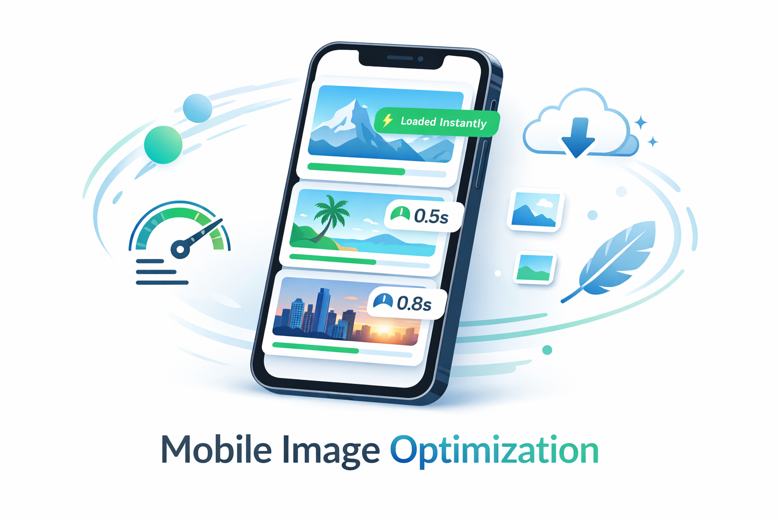
Mobile users evaluate your website in seconds. If the first screen loads slowly, many visitors leave before they read your offer, compare prices, or click a button. In most websites, images are the heaviest assets, so image optimization is often the fastest and safest way to improve page speed, search visibility, and conversion outcomes.
Why mobile image optimization matters first
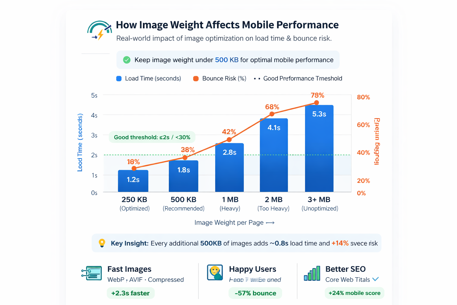
Most slow pages are not broken. They are simply carrying unnecessary image weight. A hero image exported too large, uncompressed thumbnails, or transparent PNGs used for photo content can quickly add hundreds of kilobytes to each screen. On mobile networks, that delay directly impacts bounce rate and user trust.
- Large images delay first content visibility and interactive readiness.
- Heavy galleries increase bounce probability on unstable connections.
- Slow media often reduces conversion even when copy and design are strong.
- Page speed improvements from image optimization are usually measurable quickly.
Recommended size and file-weight targets
Set publishing standards so every team member exports images consistently. These targets keep quality stable while avoiding common mobile performance failures.
| Image role | Suggested dimensions | Preferred format | Target size |
|---|---|---|---|
| Hero image | 1200 × 630 | JPG (or WebP) | 140–220 KB |
| Content diagram/chart | 800 × 500 | PNG (or WebP lossless) | 90–180 KB |
| Flow / process graphic | 800 × 600 | PNG | 110–220 KB |
Dimension consistency improves layout stability, reduces CLS risk, and makes your CMS publishing workflow much faster.
Choose format by content type, not preference
Best for photo-style hero images with gradients and natural scenes. Strong compression, broad compatibility.
Best for diagrams, UI mockups, and sharp edges where visual clarity matters more than file size.
Best delivery format in most modern browsers. Use fallbacks when compatibility requirements exist.
For this post, the safest setup is: hero as JPG and all supporting graphics as PNG.
A reliable mobile image optimization workflow
Define hero, chart, checklist, and workflow graphics before generation.
Avoid oversized source exports that require aggressive post-editing.
Apply quality tuning once and check readability on real mobile width.
Preserve layout stability and defer below-the-fold downloads.
Ensure every image path resolves from its assigned blog-assets subfolder.
Implementation pattern for reliable rendering
Keep assets organized by post slug inside blog-assets. This avoids filename collisions and keeps maintenance clean.
This path strategy is already applied in this article, so publishing only requires dropping files into the correct subfolder.
Where teams usually waste the most bytes
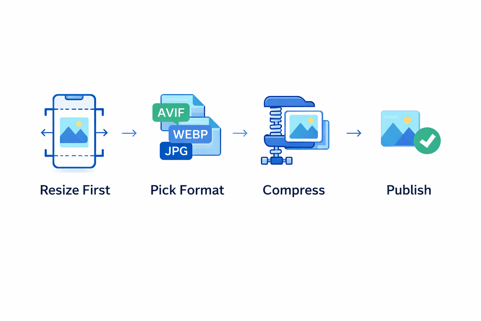
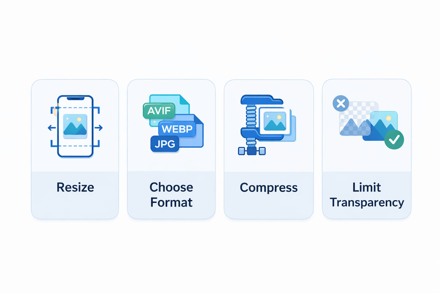
The largest waste is usually caused by oversized hero banners, repeated uploads in different dimensions, and uncompressed media exported directly from design tools. Standardizing one workflow for resize → format → compress → publish keeps performance predictable.
- Avoid publishing original camera-size images on web pages.
- Do not use transparent PNG for photo-like assets.
- Do not skip filename standards or folder structure rules.
- Always test mobile rendering after replacing images.
FAQ: quick answers for teams
Q: Should we use WebP for every image?
Use WebP where compatible, but keep practical fallback strategy where needed.
Q: Can we keep PNG for all visuals?
You can, but performance is often better when photos use JPG/WebP and diagrams use PNG.
Q: What is the safest publishing process?
Keep exact filenames, use slug-based folders, and validate all links before going live.
Useful tools for the workflow
Resize first, compress second, and convert format only when it improves the final result.