The Best Image Size Strategy for Ecommerce Product Pages
Ecommerce images are not only visual assets. They are conversion assets. If they are too heavy, mobile users leave before product details load. If they are too small, shoppers lose trust because they cannot inspect texture, finish, and quality. The right strategy is role-based sizing: one size for primary product display, another for gallery thumbnails, and a separate high-resolution source only for zoom interactions. This guide gives you a practical framework to balance page speed, image clarity, and buying confidence.
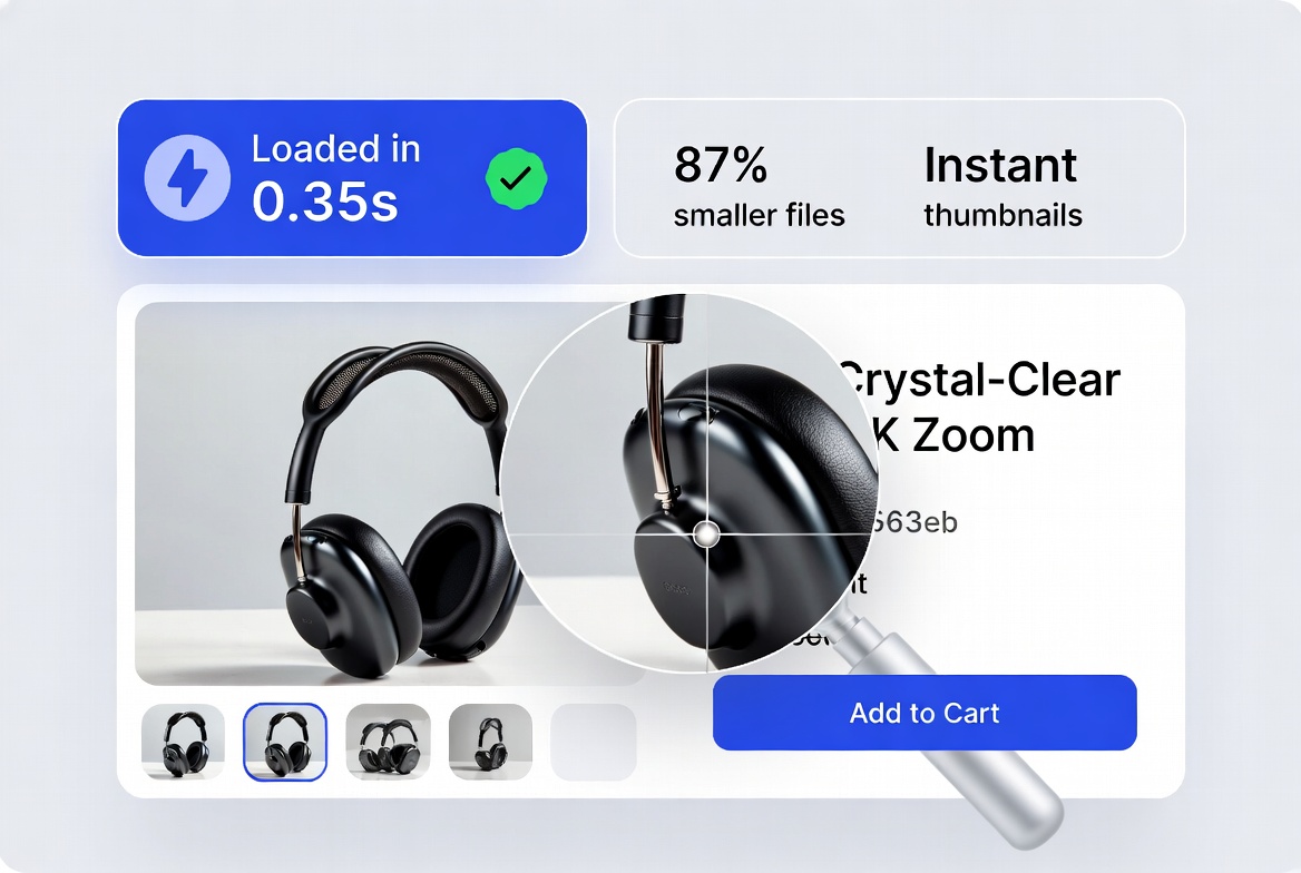
A role-based image plan helps stores improve speed without sacrificing product trust.
Why image sizing directly affects ecommerce revenue
On product pages, images carry the burden of in-store experience. They must help customers evaluate size, material, and detail with confidence. But every extra kilobyte adds loading delay. On mobile networks, this delay translates into higher bounce and lower add-to-cart rates.
- Too large: Slow first contentful paint, lower engagement, weaker conversion.
- Too small: Blurry zoom experience, reduced trust, more pre-purchase hesitation.
- Wrong format: Unnecessary payload size for common product photos.
The goal is not “maximum quality.” The goal is “enough quality for buying decisions at the lowest practical file size.”
Use role-based sizing, not one universal image size
Many stores upload one oversized master file and reuse it everywhere. That approach wastes bandwidth and slows category pages. A better strategy assigns image dimensions by role.
Displayed in product hero area. Needs clarity but should remain optimized for mobile loading.
Small preview asset for quick scanning. Prioritize lightweight delivery and visual consistency.
Higher resolution image loaded only on demand when user triggers zoom interaction.
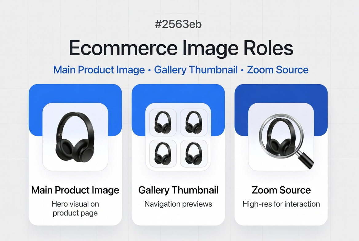
Define each image role clearly before you export files.
Recommended size and file-weight targets
These targets are practical for most ecommerce templates and mobile-first stores. Adjust based on your exact layout width and zoom behavior.
| Image Role | Suggested Dimensions | Suggested Format | Target Weight |
|---|---|---|---|
| Main Product (PDP) | 1200 × 1200 or 1400 × 1400 | JPG/WebP | 150–320 KB |
| Gallery Thumbnail | 300 × 300 to 500 × 500 | JPG/WebP | 20–70 KB |
| Category Grid Image | 600 × 600 to 800 × 800 | JPG/WebP | 60–140 KB |
| Zoom Source (on demand) | 1800 × 1800 to 2400 × 2400 | JPG/WebP | 350–900 KB |
Use PNG only when transparency is truly needed. Standard product photos almost always perform better as JPG or WebP.
Most common mistakes that slow ecommerce pages
- Uploading a 3000+ px source image directly to all placements.
- Using PNG for regular product photos with no transparency need.
- Skipping compression after resizing.
- Loading zoom-quality images by default instead of on interaction.
- Ignoring mobile network conditions and Core Web Vitals impact.
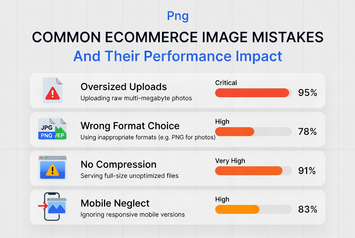
Most performance losses come from avoidable size and format decisions.
A reliable ecommerce image workflow
This workflow helps teams keep quality consistent across designers, content managers, and developers.
- Capture high-quality master image: Keep one clean source asset for editing and future exports.
- Create role-based derivatives: Export separate files for main image, thumbnails, and zoom source.
- Choose final format by need: JPG/WebP for photos, PNG only where transparency is necessary.
- Compress with visual check: Reduce weight until quality remains acceptable at typical viewing distance.
- Publish with lazy loading: Load non-critical gallery and zoom assets only when needed.
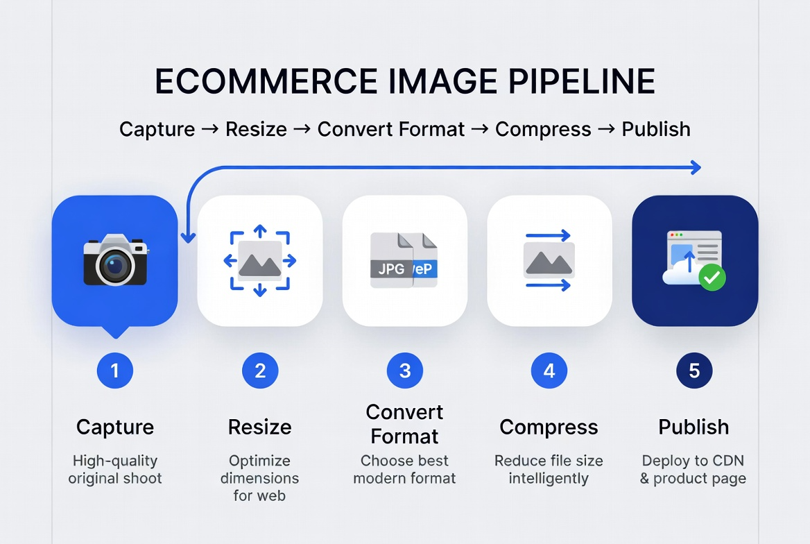
A simple five-step process keeps product pages fast and conversion-ready.
Implementation notes for practical deployment
1) Set template-aware export profiles
Define export presets based on actual component width in your product template. Avoid guesswork.
2) Separate source and delivery files
Preserve high-resolution source files in your DAM or design repository. Publish only optimized derivatives.
3) Track impact every sprint
Measure product-page load time, bounce, and add-to-cart trends before and after optimization. Use these signals to refine file-size thresholds.
4) Standardize naming and QA checks
Adopt naming standards and a release checklist so teams avoid inconsistent uploads and broken image behavior.
Frequently Asked Questions
A: No. The right size depends on your template layout, zoom behavior, and mobile traffic mix. Use role-based sizing instead of one global size.
A: WebP is often best for delivery, but keep JPG fallback support if needed by your platform or workflow.
A: Use PNG mainly for assets requiring transparency (for example overlays or certain cutout graphics), not normal product photography.
A: Resize to real display dimensions first, compress with visual QA, and load zoom assets on demand only.
Ready to optimize your ecommerce product images?
Start with one product category, apply the role-based strategy, and compare performance and conversion metrics after one release cycle. Small improvements in image delivery often produce meaningful gains in both speed and revenue.